Animated Interval

Recently we've spent some time in class working on animation in After Effects, towards preparing on-screen animated titles for our film trailers and eventually our dissertation films.
I decided to animate the identity already designed for my production company by Felt Studio in Glasgow. I use this on my business cards and you can also see it on the header of these blog pages.
It was designed after Felt undertook a branding exercise and it is intended to illustrate the nature of our practice; how my company designed, built, and managed software, made videos, and, in one special case, built artworks in collaboration with Glasgow-based Canadian artist Lauren Hall for her exhibition Like a New Religion. I digress, but, here is a short video clip of some of the machinations behind that project:
In summary, Interval is intended to represent playfulness, like the school interval which punctuates the lessons. In other words, a practice-based studio working on time-based media, a broad category that includes music, video, film, software applications, and any other media-based work that reveals itself over time. But it's also a business, so after the play comes the more serious implementation of the project with time constraints, budgets, and so on. My intention was to animate the logo to show both of these attributes.
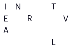
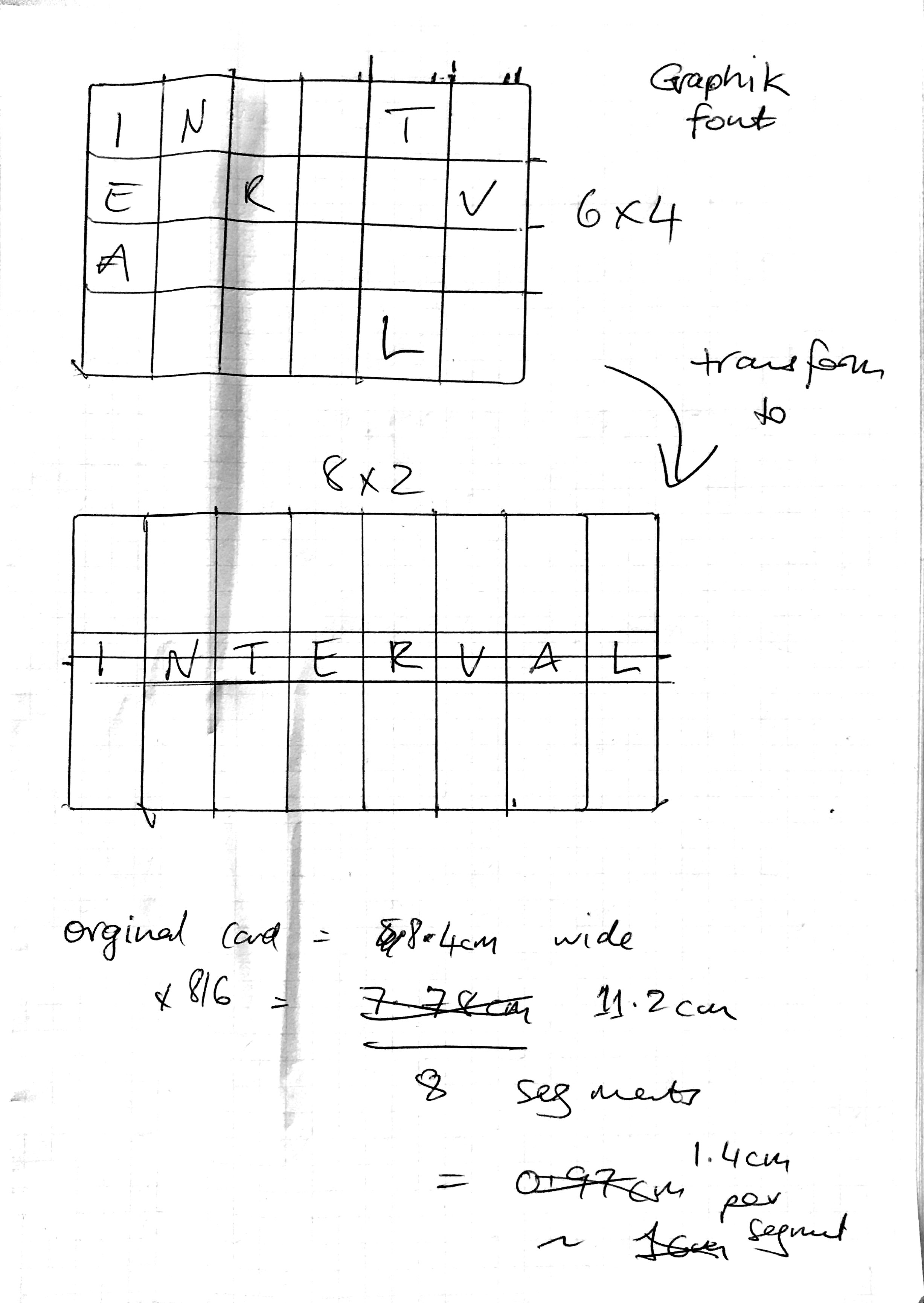
This first sketch illustrates the positions of the characters on the business card in a six-by-four array which are already in order, reading from top left, and spelling out the word 'Interval.'
The second sketch illustrates the proposed final position of the letters in an eight-by-two array with the letters spanning the two rows.
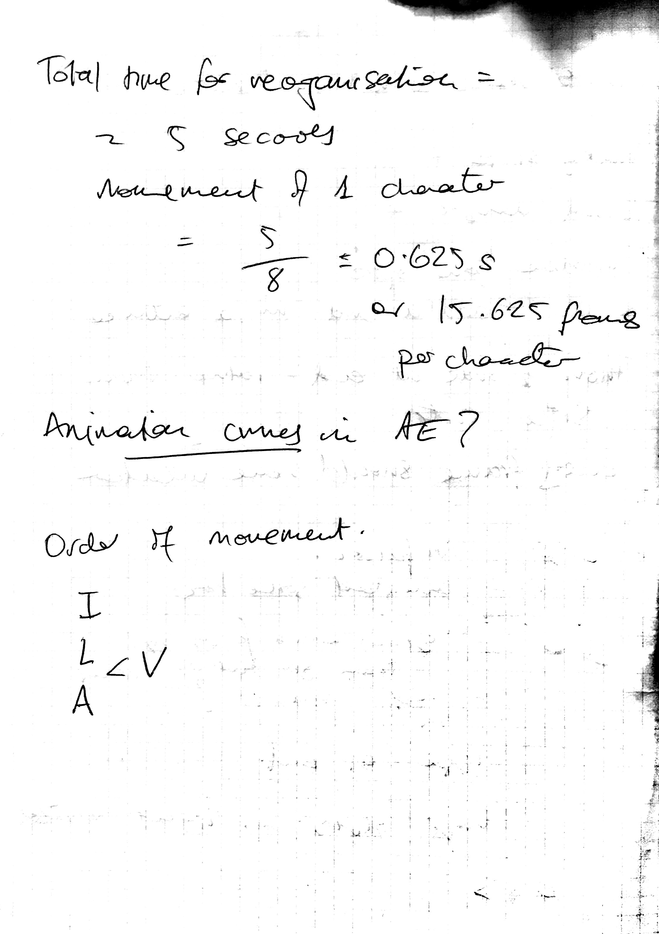
I wanted the letters to go through some form of transformation and so the simplest idea was to animate them directly into their final positions along straight curves. I did this by allocating each letter an equal fixed time and made an effort to move the letters in a manner that avoided collision, where possible.
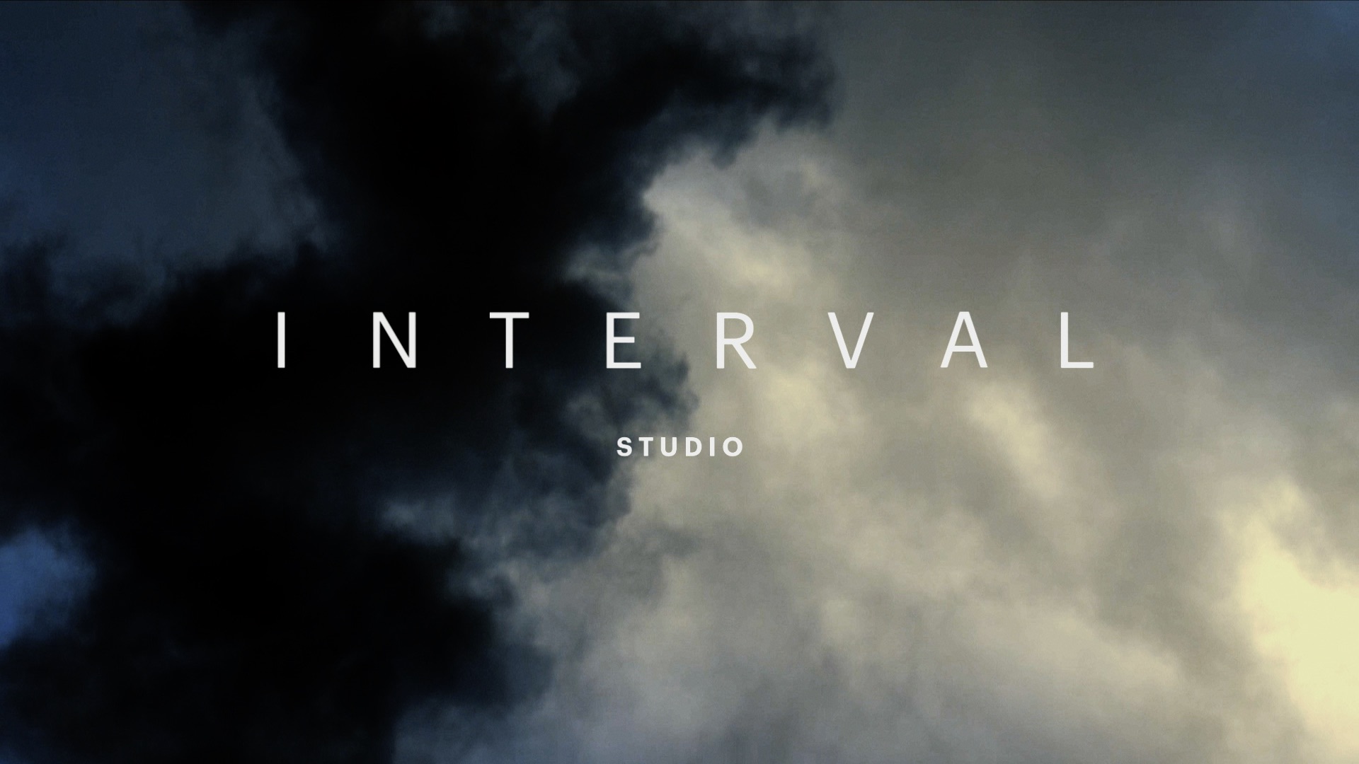
The following clip is from an experimental version of the trailer I'm working on this semester. It shows the animated logo playing over the background of the first shot of the trailer.
As this point I had some interesting conversations with friends after posing a question about how a playground full of school children might have behaved when the school bell rang and they had to get into line in front of the teacher in some predefined order. My brother, a software engineer, and I discussed an algorithm that would explain the behaviour of the children in quite individual terms. We thought of the children as individuals influenced only by their rules. Another friend, a retired marketing executive explained her theory involving clusters of children who would be influenced by a group leader and each of the groups would be self-managing. Without getting further into this I decided to just animate the characters as individual actors and adjust their movement based on heuristics rather than some formal algorithm, even though I was sure that one existed.
This next try involved animating each of the characters along a curved path. I eased the start of their movement but wanted to achieve the effect that they 'dropped' or 'clicked' into position at the end of their journey. I also arranged the curves in a fairly uniform path travelling as much as possible in the x-axis before curving and then following a straight path in the y-axis.
This version is similar to the previous one except that I have changed the ordering of the character movement slightly to ensure that the 'L' character is in place early. My perception was that this helped the viewer discern the final word earlier.
Although I prefer the final version, I asked my class for feedback and the three people who replied preferred the penultimate version. One of those who expressed a preference said the order of the character animation assisted their comprehension of the final word which gave them more time to read and understand the word.


